This portfolio reflects my public-facing work. Due to NDA restrictions I can only show certain examples of graphics, icons, and interfaces in person.
Our Place (2012-2013)
Logo, Website, Flyer
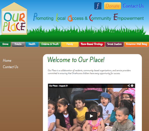
Our Place is a coalition of community groups from Vancouver’s Downtown East Side that are taking a Place-Based approach to community building and are using a website to collect and provide information for helping local families. For their logo and website they wanted something friendly, bright, and young. While figuring out their logo, I also helped them structure and organize their groupings of information. I made all of the elements and have used CSS gradients and shapes as much as possible.
Click here to see the Growing GEN7 Fundraiser flyer
Morag Wehrle, RMT (2012-2013)
Logo, Website, and Business Card
A new RMT in Vancouver was looking for a clear and simple website that would emphasize booking an appointment through the telephone while providing details about the practitioner. One challenge was to create something that emphasized comfort and softness while also indicating that the RMT is using the latest techniques in the field.
Click on this link to see the front and this link to see the back of the business card
Reclaim Sol (2011-2012)
Logo, Conceptual Designs
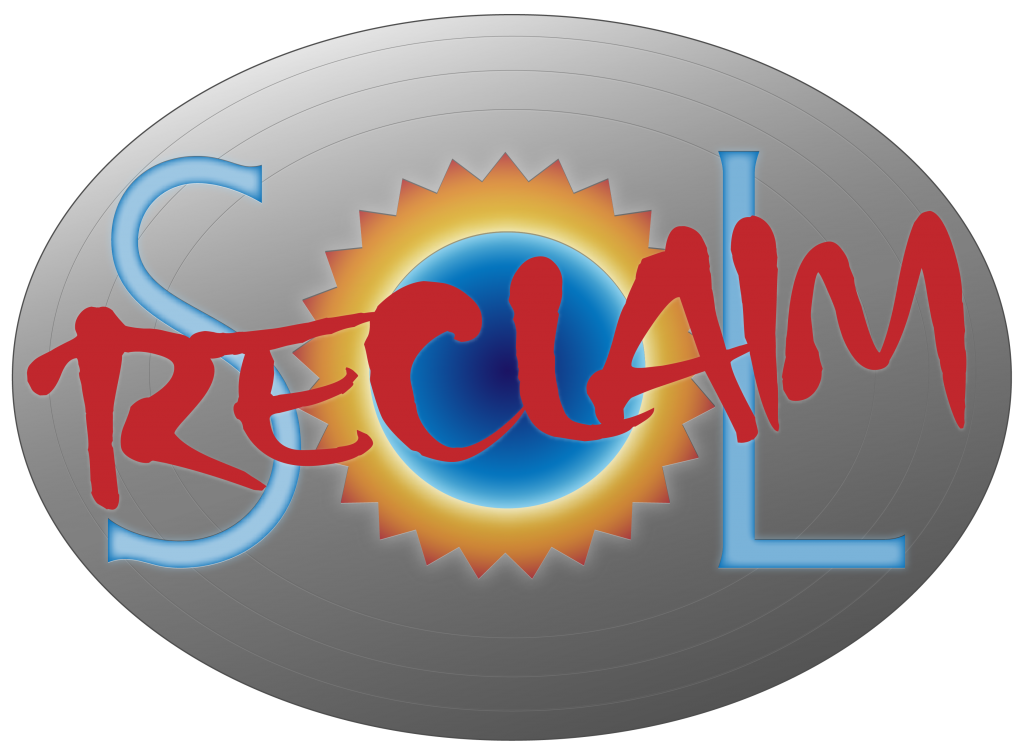
This logo was made as part of an initial attempt to define the visual language of a sci-fi turn-based strategy game for iOS called Reclaim Sol. I was tasked with representing an interstellar society that had fallen into ruins and tried to use metallic shades for smoothness and warm almost luminescent colours to indicate a gentle glow. Unfortunately, the project was cancelled by the developer before anymore work could be completed.
Daytrips From Calgary (2009-2010)
Book Typesetting/Layout and Graphics for Whitecap Books
Whitecap books contracted me to complete the book layout by setting the text and creating a colour scheme for the different sections. When creating additional graphics for the book I realized that it would be helpful to have an icon that identified places and destinations that were part of the “Hot Tips” section at the back. I presented 4 samples of “flame” icons to the designer and one was chosen to be part of the layout. I styled the flame in the shape of a rose as a nod to the prominent regional flower and as a side reference to the Calgary Flames.
Click here to see a sample page from the book
Mac the Ripper icon (2009-2010)
I was working on replacing the original dock icon for a Mac app that I used. Unfortunately, the app stopped working with the new release of OS X that year so I abandoned the project before finishing the the details on the disc and the knife. I was glad that I was able to achieve my main goal of blending the Mac Finder icon with the mask that the villain wears in the movie Scream.
100 Years of Trains in White Rock – White Rock Museum + Archives (2009)
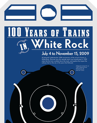
This exhibit was based on the museum’s history since it resides in the old White Rock train station. I drew a lot of inspiration from the graphic materials of the Great Northern Railway to blend the past with the present. I love old luggage tags and stickers, and wanted to make this poster have that feel. The inside joke is that the increasing font size from bottom to top actually represents the billowing smoke that would be coming from the train. This exhibit is still up, so if you’re in White Rock, then swing by and check it out!
click here to see the flickr set
The Bounty of Boundary Bay Exhibit – White Rock Museum + Archives (2008-9)
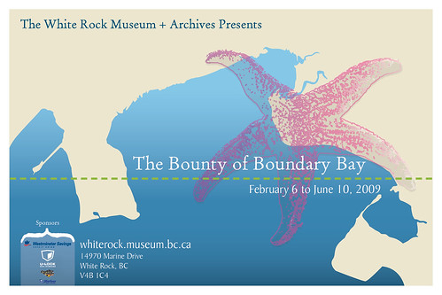
I was contacted by the White Rock Museum + Archives to design the information and photo panels for The Bounty of Boundary Bay exhibit that was up from February 6th to June 10th. Because the exhibit was about a large geographic space, I designed the panels and promotional materials around the concept of old maps that clearly separated water and land.


Recent Comments