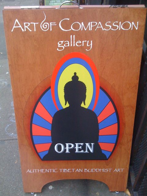
I found this example by my office when getting lunch. I showed the picture to Michelle who said she liked the use of papyrus in this instance. Michelle particularly liked the swirl for the “o” & wasn’t about to join me in ranting. Papyrus, you win that round.
However, it’s my blog & I’m here for the rants. I find this use of papyrus fascinating because it’s evidence of how designers are using it to also indicate “Asian” & at the very least somethig vaguely ethnic. You know one of those places where the people are olive coloured and the cuisine uses spices. Of some sort. I see visions of peasants & goats.
I wish Edward Siad were alive because this sign would be an interesting case of orientalism & othering. Orientalism isn’t even a fair term because Egypt has never really been viewed as part of the orient as has always been a distinct place due to its rich history & monumental accomplishments. This is perhaps the reason that the abuse of this font has gotten me all worked up. I really can’t handle how a font that is so culturally specific is being used to signify almost anything.
This example can be found at Viva fine foods & bakery. I stop in occasionally when en route to the Vancouver Museum. Tasty breakfast pastries & coffee, nice staff, but unfortunately a perpetrator of font crime.
I’m trying to figure out the usage of papyrus here as Viva’s logo is a serif font. My inclination is to think that the designer used it to mean “ethnic” in some way, but I’m hesitant because I can’t really see any additional graphics that would point to it. I’m tempted to say that the use of papyrus here is supposed to indicate “hand made.” I’ve seen it used that way in Mexico for a Children’s festival or something about a year ago and is part of the inspiration for tracking the usage of this damned font.
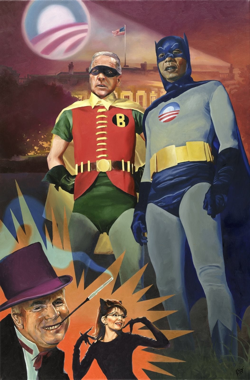
I love how this image keeps the superhero thing going into the DC world and also harkens back to the 60’s disco Batman rather than the current serious incarnation. McCain’s Penguin isn’t the main attraction for me as Palin’s Catwoman is eerily accurate because it acknowledges how she was deliberately chosen to represent sexuality with a sprinkle of predator.
And honestly, I’ve always thought the 60’s villains seemed to be the most incompetent of any Batman incarnation. They never really seemed all that scary, just sort of bumbling. Perhaps I’m a little too fond of Batman: The Animated Series villains, but the McCain campaign never really seemed all that together in the first place so bumbling is probably an accurate term. Also, I can’t help but think of how Jon Stewart’s impersonation of Dubya is very Penguin influenced, so the sense of bumbling evil really works here. I love how artist Paul Richmond really nails the campiness of Palin throughout the campain. And finally, the use of Obama’s logo here points out how deeply it struck people as a beacon and how classic it has already become. Thanks for the link Parmsy!
Paul Richmond: blog and etsy (prints are sold out)
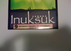
I’d actually been saving this for a while now because I couldn’t believe how Papyrus was being used to signify that somthing is handmade or hewn from stone. The full context of this is that someone sells little fake rocks so you can build your own little teeny Inuksuk in your own home.
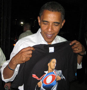
Someone has already started collecting all the different Obama buttons from the past election and is up to 10 pages so far. I love how the “I Like Ike” button is referenced here because it shows the flexibility of that original button and how Obama has already got an iconography that is starting to develop around him.

I was amazed to see the Obama camp produce such a notable design blunder when the Eagle’s crest logo came out. However, I was struck by the way the modifications to the Presidential seal were done. My favourite change was the replacement of the shield with the Obama logo, which was one of the more controversial design decisions (aside from the nomination of Sarah Palin, but more on that later) of the Presidential race. I say favourite design decisions because it blurs the line between the Obama logo and the Captain America shield in a manner that I don’t think was ever intended.

Before the circular shield.
If you look closely at the presidential seal, the Obama logo replaces the shield that was borrowed for the original Captain America shield. The Obama logo becomes a fitting replacement when thinking of the Captain America badge shield and how it was replaced by the now standard circular design. In a way, the designers were updating the original iconography through the lens of how that one graphic element has been redefined through it’s adoption into the design of Captain America. I think a large part of the reason a lot of Americans reacted strongly to the Obama seal was because it graphically replaced The Office with a person.
However, to me the relationship to Captain America is more interesting than any possible overtones of emperorship because Obama’s own story is one of growth, achievement and willingness to charge into the fray. I find it really remarkable how the Obama campaign was able to generate a sense of excitement through graphic design and how people on a large scale were making their own graphic contributions. My newest favourite from the professional set comes from comic legend Alex Ross who captures something that I think most of us were
envisioning but didn’t have the capacity to embody like he does.




Recent Comments