
image from Boing Boing
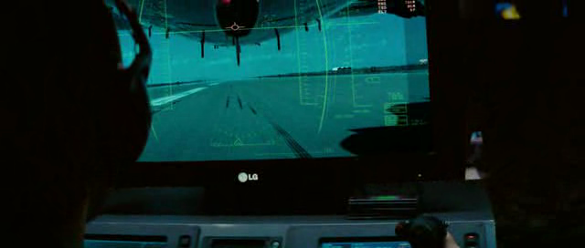
Recently I caught a Boing Boing post about the USA’s deployment of predator drones along the Mexican border and it made me think of the sequence in Transformers 2: Revenge of the Fallen. It’s the sequence where the Predator drone is launched after the Decepticons knock out communications in the area and it’s the military’s last resort. Even though they’re pals with advanced alien robots, the American military’s only option is the Predator. This puts a new spin on illegal aliens.
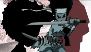
I’ve been thinking about the adoption of the martial arts in Western culture for a while. However, it’s really been on the front of my brain since this spring when watching The Boondocks. I had noticed it right from the title sequence where Huey is brandishing a sword. In particular I was really blown away by the action sequence in the episode “Let’s Nab Oprah” (s01e11), where Huey is starts off his fight against Riley with what appears to be a katana. I was shocked by how dynamic the animation was an how they used a camera really effectively to give the fight a “live” feel.
I started to think about this sequence again after starting to watch Samurai Champloo late at night before falling asleep. The way Samurai Champloo merges of hip hop culture with Edo period Japan has started me thinking about how African American culture has engaged with the martial arts and how Asian cultures have engaged with hip hop. I’m going to start researching how aspect of these two culture that have traditionally been thought of as separate or distanced have merged in a fascinating and wide-sweeping manner.
I guess the reason I’m so interested by this is that it appears both cultures are cool with it and I’d like to look at how that’s happened and how representations of each have changed over time. My mind immediately jumps to thoughts of the Wu-Tang, Hot Potato and “Samurai” Mike Singletary. However, can’t help but think that Kareem Abdul-Jabbar and Bruce Lee’s fight in Game of Death has something to do with it. So that’s my plan and this is where I’m going to gather my research. First up is the general adoption of the martial arts in Western Culture and what responses were in different countries as knowledge of Asian fighting styles started to spread. For example, I can’t wait to find out when where the martial arts first started to be taught in military academies and how those students first responded. And also to begin considering the introduction of western music to Asian cultures and how that either meshed or conflicted with traditional styles.
 As if it were necessary to prove the expression that everything happens at once, but here I go anyways. This weekend I’m heading down to Seattle for Bumbershoot (Neko Case and Jenny Lewis on the same weekend) and PAX but am cursing the fact that I won’t get to see The Secret of Kells at the Vancouver International Film Centre or the sold out The Agony And The Ecstasy Of Steve Jobs as part of the PuSH Festival.
Vancouverites are in for an animated treat this weekend a the Secret of the Kells is a gorgeous piece of cinema. The 2009 Academy Award nominated film is a complete crowd pleaser with stunning design and a really engaging story about 12 year-old Brendan that is learning to be a scribe while facing off against raiding Vikings and a Celtic serpent god. It’s really not necessary to throw any more adjectives at the film, but the Cartoon Saloon studio in Ireland really hit one out of the park. Plus I’m for anything that’s also sings the praises of book design and illuminated manuscripts. So if you started to think about why the title sounds familiar, it’s because the story is also a reference to the famous Books of Kells which was done by Celtic Monks in the 9th Century.
The Agony and Ecstasy of Steve Jobs is a monologue by Mike Daisey who actually went to China to see what was going on in those factories where workers were committing suicide. I’m interested in the way that Daisey presents his findings because he’s an Apple user and I’m fascinated by the way he was willing to face his own complicity. Especially the day after the big September 1st keynote.
Death by VHS was the name of Clint Enns and Leslie Supnet‘s awesome program of short films from Winnipeg through the DIM Cinema series at the Pacific Cinematheque on Monday the 30th of August. Link soup follows.
Cattle Call (2008) by Mike Maryniuk & Matthew Rankin
Thunder at the Track (2005) by Walter Forsberg
Zwei Indianer Aus Winnipeg (2009) by Darryl Nepinak
How to Care for Introverts (2010) by Leslie Supnet
I’m Bohunky-Dory With it (My Nose) (2007) by Sandee Moore
Drawing Genesis (2007) by Jaimz Asmundson
Pants! (2007) by Divya Mehra
Discovering Compositions in Art (2008) by Heidi Phillips
The Death of Natural Language (2007) by Clint Enns
Trafiiiik (2007) by Robert Pasternak
Brodeo in Leather (2008) by Gwen Trutnau
Cold Satie (2007) by Simon Hughes
Mechanical Film Studies (2010) by Andrew Milne
In the Drugs (2006) by Hope Peterson
Death by VHS (2010) by Damien Ferland
Thanks Clint and Leslie!
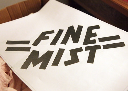
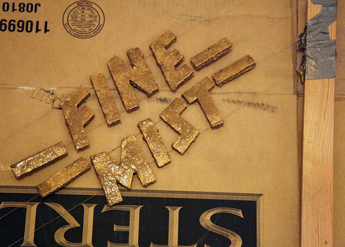
Back in September I had spoken to Megan and Jay of the amazing band Fine Mist about helping them make some t-shirts. They needed help because they were trying to recreate a design that had originally been done in scotch tape and gold spray ink on one shirt, but were unable to make multiples because the tape was destroyed when they peeled it off the shirt. Megan really liked the spray paint look and that the tape masked off the words “FINE MIST” leaving the lettering the original shirt colour.
As a screen printing nerd, I found their project interesting because it presented quite the challenge because it required inverting the printing process. I had thought that we could use masking tape to create the lettering and then block it out properly using screen filler. However, when I was gathering my supplies and making the screen I started to wonder if using a screen would prove problematic because the spray ink would either dry on the screen or clog it entirely if the spray was not powerful enough to penetrate the screen after being sprayed. Nevertheless, we had to try using a screen because it presented the simplest way of producing shirts in runs rather than one at a time. Or at least we thought.
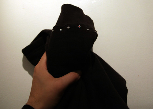
After spending a couple of hours creating letters out of tape and carefully arranging them on a screen, we were ready to print. However, we only were able to produce one shirt that night because the ink did clog the screen, which meant that we would have to wash the screen out and start over once it dried. I can feel the ghosts of Ford, Taylor and Disney shuddering at my failed attempt to industrialize a process and the lost hours of labour. But R&D is forever fraught with inefficiencies and it was still fun hanging out with Megan, Jay and Kate, eating pizza and bedazzling the cuffs of a hoodie belonging to Edo Van Breemen of Brasstronaut.
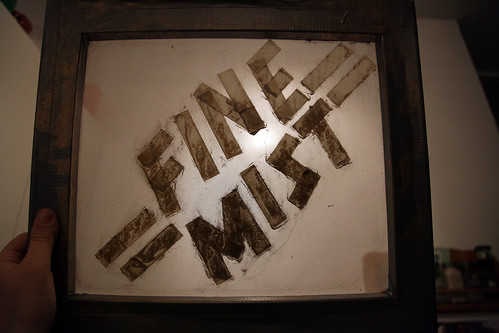
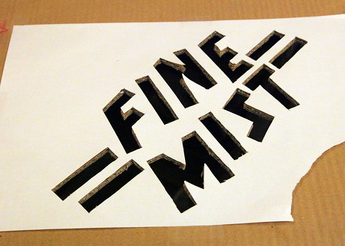
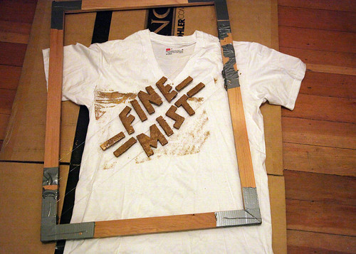
Back at the drawing board (a.k.a. watching season 3 of Dexter) I came upon the notion of cutting the letters out of cardboard and fixing them to a frame by using either fishing line or a really thin wire. Since I already had a photo of the lettering I was able to reproduce it exactly as it was by tracing the letters in illustrator and then printing out the PDF.
Tools
1 roll of duct tape
1 roll of 30 gauge flower and craft wire
2 30 inch canvas frame pieces (I got mine at Opus)
2 22 inch canvas frame pieces
1 pair of wire cutters
1 box cutter
1 x-acto knife
2 printouts of the lettering
1 large sheet of thick cardboard (I had some in my apartment because I’m a craft hoarder)
1. Build the frame and secure it by taping the corners using the duct tape. I used about 6 inch strips on the long and short side to really lock the pieces together.
2. Tape the printout to the cardboard and cut the outline of the letters using the box cutter. Since the cardboard was really thick, I used my x-acto knife for the more delicate final cuts. Leave the cut letters in the cardboard.
3. Flip over the cardboard and place the frame around it, with the front of the frame facing down. Position the cardboard to make sure that the letters aren’t too close to the edge since we do not want to create hard lines when spraying.
4. Start running the wire from one edge of the frame to the other, making sure that it runs across the top part of each of the letters. Secure the first edge by winding the wire around the frame and then using the duct tape to secure it firmly. Stretch out the wire so it’s taut before securing it to the frame. Or start taping down the wire to the letters before securing the other edge. I didn’t find any advantage to doing it in either order. Once everything is secured, repeat the process for the bottom of the letters. Since we were doing two words with dashes, I then repeated this step for the other word.
5. Now that the lettering has been secured to the wire, pop out the letters from the cardboard and check to see if there is any slack to the wire. If there is slack (there was in the mine), simply press down wire against the frame and secure it with duct tape. And then you’re done! I had to do some small adjustments to the dashes, but they stayed in place even though they only had one line behind them.
Click here to check out Fine Mist’s Myspace page
Click here to check out tracks from Fine Mist related projects, like Jay’s new solo EP, last year’s Jay Division
Click here to get Jay’s new EP Bird of Prey and listen to his remixes and other things (Thanks Jay!)
Click here to check out Kate’s photos from the Commodore
Check out the video of Fine Mist performing their song “Because of the Ocean” at the Commodore, where they opened for Sloan
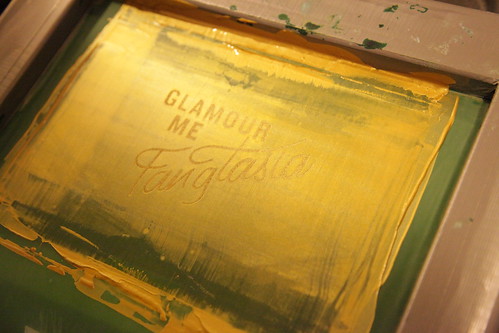
On Saturday December 5, Michelle, Mauve and Setareh who work together at Whitecap books dropped by to do some screen printing and so I could do my tortilla tutorial that I had wanted to do for Michelle Meals. I had 4 screens assembled and prepped with photo emulsion so we didn’t waste any time with waiting for screens to dry any more than they have to.
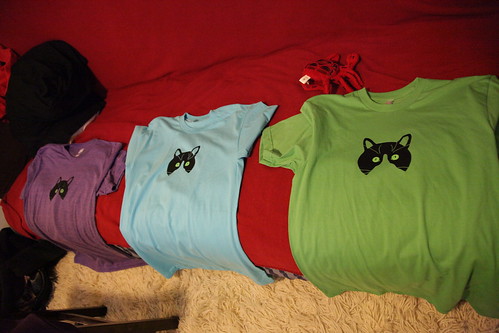
The easiest part was getting Michelle going since I still had her screen from the Peanut shirt that she made about a year ago. Michelle printed her 3 colour separation in the order of green eyes, black head, and white features. Alignment is the toughest challenge with Michelle’s print because we put the 3 layers on a smallish screen.
I set the first screen to start developing and we started printing Michelle’s shirt. There were no glitches with the photo emulsion process for any of the shirts, so they came out really neatly. The one danger with using the wooden frames is that water gets trapped between the screen and frame. I have a hard time creating a full seal between the wooden frame and the fabric screen since the tape won’t stick to the wood through the screen. It’s a good idea to get a layer of the emulsion in there when coating the screen to create a full seal so water doesn’t get trapped when washing out your screen.
Mauve did some undies inspired by The Wire. I was really impressed how Bub’s outline turned out and decided to keep the screen to make more prints with different colours.
Check out the full set of pictures at Flickr!
And keep track of what Michelle eats!
Back in June I travelled to London to visit friends and the Netherlands to finally make a pilgrimage to the country that sprang forth Piet Mondrian and MC Escher, two of my favourite artists.
Why would someone on this trek to visually ransack a culture with a long line of talented artists then decide to go see Transformers: Revenge of the Fallen? Well, after spending days admiring Amersfoort, the Hague and wandering past the nightlife of Amstersam, I needed to give my feet a break from the torrid pace I had been taking. The amount that I walked was honestly ridiculous considering Dutch cities are designed around the bicycle and after several days of admiring Dutch gazelles zipping by on their bikes it was clear that being on foot was a lesser experience.
The decision to see the movie came while I was contemplating my night’s entertainment during a much needed stop at an internet cafe as photos uploaded to flickr, email was checked, and general internet browsing provided entertainment. After reading the io9 review of Transformers that marvelously described the film as Michael Bay’s first art film I was hooked on the idea of witnessing this atrocity for myself. Plus, I was really fascinated by how a bike loving Dutch audience would respond to a very American film about the American love affair with the automobile.
What I didn’t expect was sitting next to an American.
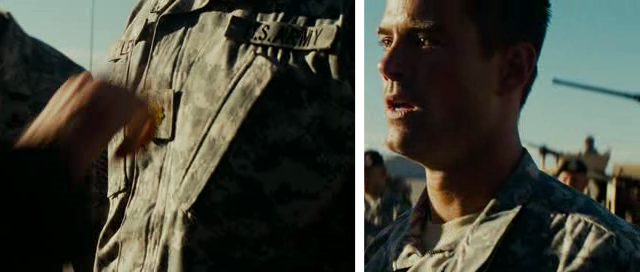
Ok, I may never have spoken directly to the guy but his responses to the different parts of the film indicated that he was not only American, but was either a current or former member of the military. For example, during the moment that Major Lennox (Josh Duhamel) was being stripped of his command by Director Galloway (John Benjamin Hickey) he said, “Fuck you!” With fast “fuck” and a tight “you” that slowly decreased in emphasis. All this told me that he shared a sense of agony with Lennox and that he was having an emotional response to the scene. Yes, Transformers for at least one dude was an emotionally significant event.
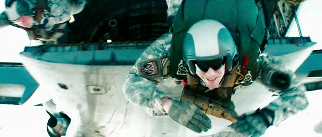
I found Transformers: Revenge of the Fallen as completely ridiculous i09 made it out to be. However, I was surprised by the emphasis on the awesomeness of the US military. Being next to a guy who not only got excited by the when John Turturro referenced to the troop transport, but also “Hooahed,” I found it hard not to pay extra attention to the military. For example, the final section of the film was littered with sequences devoted to showing off the military and its technology. I found the sequence where the troops jump out of the plane and one of the soldiers looks directly into the camera to be striking because it’s a weird way for the film to break the fourth wall in a manner that emphasizes the fun of combat prior to the launching of the MQ-1 Predator.
At this point a film that is dedicated to showing the coolness of the Autobots and also shows the coolness of the latest military gear that gets sent out when the chips are down and communications in a warzone is knocked out. The focus on military technology isn’t surprising considering that technology is at the core of the story since the Transformers are creatures of technology and their awesome tech now parallels the military’s awesome tech. But given that the entire narrative around the Transformers only exists to sell toys and other merchandise and the film is wall to wall with product placements, it really presents the military as another product to be promoted alongside cars, webcams, and life insurance.
In the end, I wasn’t surprised that the Dutch audience groaned like a Canadian one does when American films like Michael Bay’s get too flag wavey and chest thumpy. But at the same time we do go watch, sometimes out of sheer wonderment at the culture and people that films are aimed at.
Back in September I was contacted through a friend about designing a website for an architect based out of White Rock. After meeting with Keith and Michelle, I was really impressed with their approach to architecture, space and light and took on the project. Liz and I did a mini-roadtrip one day to get a better sense of what the churches were like since they were all really quite different in their materials. Some weren’t even completely new buildings, but rather additions to pre-existing churches like the one above at Sharon United in Murrayville (south of Langley). I set out to create a wordmark that reflected the delicate balance of old and new that I saw in the buildings and after some review and discussion the final logo was settled upon. They wanted the background of their site to be taken from the passage of light through amber-coloured stained glass, so I was handed a couple of sample pieces that I photographed in different light. I’m excited to have this project completed and that it matches what they had envisioned when setting out on the project.
Go to the Keith Sullivan Architecture Inc. site
Go to the flickr set of amber backgrounds (creative commons)
For Rich’s birthday I decided to create a beer brand and label for the home brew that he’s been cooking up since the summer. The first batch was named after our softball team, the Re-Ups, but we all agreed that the beer should be its own thing. I batted a couple of ideas about and settled on the name Huxley’s Home Brew in honour of Aldous Huxley and Rich’s Dad who is a Huxley scholar. I also thought about calling it Lamey’s Mill Brewery after the street that Rich lives on and even designed labels and caps for that name, however, I had an idea that Rich would prefer Huxley’s because of the reference and because it was important to refer to the home brew since the beer is actually brewed in a closet in his apartment. So, Huxley’s it is.
I also made up a flash timer that tells when the next batch is done, so let the countdown begin!







Recent Comments